Friday, December 30, 2011
Great post on design principles for Scrapbooking
Laura Banasiak, a digi designer (check out her shop at Scrap Orchard), wrote a terrific post over at DigiShopTalk about design principles for Scrapbooking. She hits all the highlights with examples for each to make it easy to visualize each principle. Highly Recommended!
Saturday, October 8, 2011
Tipsy: What a little shadow can do for you
Last week I was out taking pictures at my favorite place, Disneyland (where else?) and while I was waiting in line at Toy Story Midway Mania, I was snapping pics of some of the great poster art decorating the queue. This one caught my attention not because it's the most interesting (it's not) but because it suddenly occurred to me that one of the reasons the art is so great is because of the terrific shadowing.
The posters are absolutely 2-dimensional, but the darts look like they are standing straight out, like you could reach out and touch them, and it's because of the shadows applied to the design. Here's what I mean. On the poster on the right, the darts appear to be popping off the page. Or look at the pink balloon near the top. The words also appear to be dimensional ("Surprises Galore.")
In the circle on the left is a close up of one of the darts. It's really 2-dimensional, but it's shadowed to make it appear 3-dimensional. Clever, right?
When you see a great design that catches your eye, it's worth it to stop and think for moment. After the initial "this is awesome!" let it soak in for a second until you start to analyze WHY it's terrific and you might learn something useful for scrapbooking.
I've actually done this on a digital scrapbook page, but only once. I was using this awesome book element as if it was an actual scrapbook page, and placed the photo I was showing off "in" the book. I used a handwriting font for the description, and then shadowed a feather pen to make it appear is if it was standing up off the page.
Very briefly, here's how I did this. I made a copy of the feather element and placed it under the original feather. Then I rotated it and resized it until it was in a position that it looked like where a shadow would fall. When resizing, I am generally careful to re-size proportionately, but in this case, it actually works better to shrink it disproprtionately. Think about when you are walking outside at sunset and your shadow is really long, or at midday when your shadow is really short because the sun is overhead. Shadows are not always the same!
Back to how I did this, after stretching and shaping my second feather in the shape I wanted, I added another new layer. I "hid" the second feather by clicking on the eye in the layers palette, and then I selected the layer by using CTRL+clicking on the layer thumbnail. (All of this is working with the second feather that is the shape of the desired shadow.) Next, I simply used a the paintbrush tool to paint in that selection on my blank layer. I used a grayish blue color rather than black. Once my shape was painted, I reduced the opacity of that layer until it looked right.
That was a really quick explanation, please comment if you have questions!
Saturday, September 24, 2011
Charlie and the Trains | July 11, 2011
I scrapped! I haven't been doing nearly as much scrapping and have been doing even less posting on the blog, unfortunately. (My other blog is suffering too; I'm an equal-opportunity blog neglector.)
Last night I was baking and hanging around home when I noticed there was a Speed Scrap happening at ScrapMatters, and it was kicking off around the time my last batch of brownies was coming out of the oven. Perfect!
I grabbed this photo of Charlie playing with the trains, and searched my stash for some transportation-themed supplies, and this is what I created:
"CHOO CHOO!!! Charlie has lots of toys to choose from at Oma’s house:
cars and books and on and on. Today, he set up the trains and of course
I couldn’t resist getting out the camera to capture my favorite cutie.
- July 11, 2011"
CREDITS: Birthday Blog Train Template Freebie by WM[squared
FONT: FG Sara Elizabeth
FONT: FG Sara Elizabeth
Sunday, July 3, 2011
Tech Girl After All | 2011
So, a few people have told me lately that they are following me scrap blog, and I have been TERRIBLE at posting anything. Guess I'll have to remedy that!
I'll start with this one. I created this page just for fun to use this scrapbook kit, Techno-Girl by Pixel Gypsy. How could I resist all those adorable doodled elements?
but then i got a laptop
& an ipod
& a sweet digital camera
& a smartphone
& a tablet.
once photoshop & i became friends,
my laptop and i became inseparable.
So yeah....
i guess i am
a tech girl after all!
The only correction I would make to this page is that I don't really have a smartphone. I've taken to calling it a "dumbphone" and swearing at it under my breath now and then because I. Hate. It. Maybe someday my techy status will rise to the level of an iph*ne. Maybe.
I'll start with this one. I created this page just for fun to use this scrapbook kit, Techno-Girl by Pixel Gypsy. How could I resist all those adorable doodled elements?
The journaling on this page reads:
i never thought
i’d be a “tech” girlbut then i got a laptop
& an ipod
& a sweet digital camera
& a smartphone
& a tablet.
once photoshop & i became friends,
my laptop and i became inseparable.
So yeah....
i guess i am
a tech girl after all!
The only correction I would make to this page is that I don't really have a smartphone. I've taken to calling it a "dumbphone" and swearing at it under my breath now and then because I. Hate. It. Maybe someday my techy status will rise to the level of an iph*ne. Maybe.
Labels:
AAM
Wednesday, May 11, 2011
Guest posting on Krisi's Kreations today
I wrote up a little post today about about my latest hybrid project on the Krisi's Kreations blog. To read more about the creative process behind this project and see a bigger picture, hop on over there and check it out!
Friday, April 8, 2011
Font Friday: peach sundress
I seriously have a font problem. I have close to 1000 fonts on my computer, and somehow it's not enough when I find another adorable typeface. This one is cute and whimsical, and I had to have it the moment I first laid eyes on it! "peach sundress" is available at dafont.com.
Wednesday, April 6, 2011
ABC Book | Christmas 2010
I've been doing a lot of organizing of my files on my computer and online. I've have tons of projects I completed over the last 6 months or so that never made it on to the blog, so I'm picking some of them for new posts, since I've cut back on how much scrapping I'm doing right now.
This book was a looooooooooong time in the making. I started it last spring, and finally finished it just a day or two before Christmas when I gave it to my nephew as a gift. The book contains a page for every letter of the alphabet, and two pages at the end show counting from 1-10. Since it's so long, I thought I'd experiment with a slideshow on this post. Here goes!
This book was a looooooooooong time in the making. I started it last spring, and finally finished it just a day or two before Christmas when I gave it to my nephew as a gift. The book contains a page for every letter of the alphabet, and two pages at the end show counting from 1-10. Since it's so long, I thought I'd experiment with a slideshow on this post. Here goes!
Friday, April 1, 2011
Font Friday: Pass the Chex
I have been looking for this font FOR.EVER and I can't tell you how excited I am to have finally found it!!! Leave it to the fabulous Kevin & Amanda to be the creative souls. Best of all, you know what that means - this font is FREE!!!! You can find Pass the Chex here.
Here's the name of the font spelled out, first in CAPS, then in lowercase. I love the funky mismatched sizes and styles of letters, especially the polka-dot letters.
Happy downloading!!
Here's the name of the font spelled out, first in CAPS, then in lowercase. I love the funky mismatched sizes and styles of letters, especially the polka-dot letters.
Here's my name in the font. I typed it in both upper and lower case,
then picked from the two to get just the mix I wanted.
The numbers give you a feel for the randomness. The sample below is actually all one font size!
Happy downloading!!
Tuesday, March 22, 2011
Photo Geek: California Screamin'
This is my very favorite ride at the entire Disneyland Resort. I love the countdown to the launch, the super-fast acceleration, the soundtrack, the hidden Mickey that I found on my own. These photos were again from a day where there were very few crowds at the park, and I think I rode this coaster three times. Twice for sure, maybe 3 times. I really love it!! Then I walked over to watch the launch of a few trains, and got the idea to take a few pictures. I balanced my camera on a railing for most of these, and the experimenting began.
I started with my camera on the action setting, so the camera knows I'm trying to capture something fast and it selects appropriate settings. What's useful about that is being able to check the settings the camera picked because it gave me a good place to start when I went to more manual setting. The camera started at a shutter speed of 1/800 sec for action shots. After a few clicks, I realized I had the camera set at ISO400, so I switched to ISO 100 and started slowing down the shutter speed because I decided it would be fun to try and capture the action in my shot instead of trying to "freeze" it. I also started shooting in shutter priority mode, letting the camera pick the aperture. Here's a shot from after those initial changes:
I started with my camera on the action setting, so the camera knows I'm trying to capture something fast and it selects appropriate settings. What's useful about that is being able to check the settings the camera picked because it gave me a good place to start when I went to more manual setting. The camera started at a shutter speed of 1/800 sec for action shots. After a few clicks, I realized I had the camera set at ISO400, so I switched to ISO 100 and started slowing down the shutter speed because I decided it would be fun to try and capture the action in my shot instead of trying to "freeze" it. I also started shooting in shutter priority mode, letting the camera pick the aperture. Here's a shot from after those initial changes:
ISO 100, F5.6, 1/500 sec. (remember the camera started at 1/800 sec.)
At this point, I just kept dropping the ISO to get the motion effect that I wanted, from 1/500 to 1/200:
ISO 100, F11, 1/200 sec.
Then from 1/200 to 1/124:
ISO 100, F10, 1/124 sec.
Then from 1/124 to 1/100, where I got this shot. I was also really hoping to get the photo I wanted with the RED train because I thought it would be the best contrast and create the most interesting photo. I was pretty happy with this one:
ISO 100, F14, 1/100 sec.
I took a few more shots of the following trains, but eventually got bored of standing in the same place. By the time I got done, I had taken about 20 pictures in this one spot. It wasn't until I got home that I decided this very last shot with the yellow train was my favorite. The camera settings are the same as the one above with the red train, but by zooming out, the train is placed in the setting better. Also, as it turned out, the yellow provided a better contrast with the blue sky and the bright red roof in the building behind the coaster. I think I have a winner. :)
ISO 100, F14, 1/100 sec.
Saturday, March 19, 2011
Photo Geek: Space Mountain
You know you're a photo geek when... you have fast pass but get in the standby line anyway just so you can get a picture. And here it is:
This photo was a little grainy due to the high ISO, but I'm not sure I could have done much better without a tripod. I did take a few shots at ISO 800, but I started to lose clarity due to a longer exposure (1/8 sec.) I guess proof of a true photo geek is bringing a tripod to Disneyland?
ISO 1600, F5.0, Shutter 1/13 sec
Processing: High Pass Filter, 25 pixels
Monday, March 14, 2011
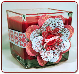
Flower Candle | Hybrid
This was easier than it looks!!!
Recipe for a cute hybrid project:
1 - 3" square jar candle
4 - large hearts punched out of pink/yellow paper (approximately 1 3/4" x 1 1/2")
4 - large hearts of white printed paper
5 - small hearts punched out of red printed paper (approximately 1/2" x 1")
1 - 2" circle of paper
1 - 1"x11" strip of printed paper for the band
1 - button, about 1/2"-3/4" diameter
3-4" narrow white ribbon
First, glue the band around the candle. The 11" wasn't quite enough to go all the way around, but the place that is not covered by the band is where the flower is glued on.
Next, use the 2" circle of paper as the base for the flower, and the first layer is made from the pink/yellow paper hearts. Cut a slit in the heart, about halfway up from the point, and overlap the now two points and glue them. This will give your "flower petal" some dimension, and you can fold/wrinkle/bend it as you like. Repeat for 3 more pin petals, and glue them on to the 2" paper base.
Next is the 4 hearts from the white printed paper. First, cut across the heart, removing the point, about 1/3 of the height of the heart. Then, like with the pink "petals," cut a slit, overlap the bottom sections, and fold/wrinkle. Then glue these on top of the pink hearts.
Last, is the 5 red hearts. This was made from a smaller, narrower heart shape in my example, so you may or may not want to cut the point of the heart off before shaping them, just like the larger heart-petals. Layer these on top of the flower.
String the ribbon through the button and tie a bow, trimming the ends of the ribbon to your liking, then glue the button on top of all the heart petals to hide the unfinished edges.
Last step! Glue the entire heart on to the candle, and done!
Friday, March 11, 2011
Font Friday: junko's typewriter
I'm going to try and get back to posting fun fonts again! Another new font obsession I have is with typewriter fonts. I've been having fun with this one recently, and the kind of cool thing is that I've actually used it twice in the last couple of weeks. First, the font, junko's typewriter, available on dafont.com:
I like it because it's random and kind of has a "ransom note" quality. The messy spatters are really fun, as are the funky angles and varying sizes. Mix in caps with the lowercase adds even more fun, like in this flyer I made for my church:
I used it as part of my title in this scrapbook page. I created this page as part of a "speed scrap" challenge, and I combined two of the instructions, use a font and an alpha for the title and use a spatter or splat, and used a spattered font.
Monday, March 7, 2011
You know you're a photography geek when...
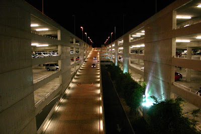
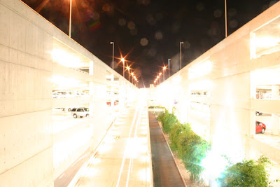
Last week, I went to Disneyland for part of a day. At the end of the day, I was stopped by a cast member taking a survey wanting to know how many rides I'd been on that day. Keeping in mind that on the day I went the place was as empty as I've every seen it, I went on... 6 rides in 6 hours. However, my photo count for the day was 178 frames. That's 30 pictures an hour, or one every 2-3 minutes. The photos I'm about to post are boring. They are of the parking lot. But, they did provide a chance to stand in one place and tinker with photo settings until I got the photo I wanted. :)
I started with the camera in Program ("P") mode because I knew I definitely wanted to keep that pesky flash from firing. A shot in that mode is useful to know what the camera picks so you know what to start changing. For all these photos, I was using an improvised tripod by setting my camera on a railing. (And lest you have a sympathetic heart attack about the camera sitting on a railing 4 stories above a street, you should know the strap was still around my neck!) Here's what I got, and really, I was happy with this photo as a snapshot:
This is still not perfect as it's still a little bright, but I had fun and learned something, so that's what counts, right?
I started with the camera in Program ("P") mode because I knew I definitely wanted to keep that pesky flash from firing. A shot in that mode is useful to know what the camera picks so you know what to start changing. For all these photos, I was using an improvised tripod by setting my camera on a railing. (And lest you have a sympathetic heart attack about the camera sitting on a railing 4 stories above a street, you should know the strap was still around my neck!) Here's what I got, and really, I was happy with this photo as a snapshot:
Geeky details: ISO 1600, Exposure 1/60th of a second, F-stop f/4.50
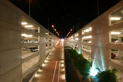
Then I started to play around a little because I wanted to see if I could get a cool effect with the moving cars. I can't remember if I switched to Shutter mode ("TV") or Manual ("M") for the rest of these shots. If I was in Shutter mode, the f-stop was selected for me by the camera. If I was in Manual, I set it myself. I do know that I increased my exposure time, and reduced my ISO, and this is what I got:
Geeky details: ISO 800, Exp 5 sec, F-stop f/22
I don't remember really looking at this image on the camera screen too much before bumping my exposure up again. At the top of the ramp, just about dead center of the photo, there are headlights, but 5 seconds was just not long enough to get the effect I wanted. So here's what I got next - WARNING: Sunglasses required!!!:
Geeky details: ISO 800, Exp 10 sec, F-stop f/22
It was when I saw this image that I realized for a long exposure I needed to change my ISO, so I dropped it all the way to 100. Ah, much better:
Geeky details: ISO 100, Exp 10 sec, F-stop f/22
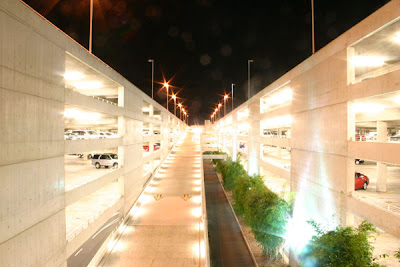
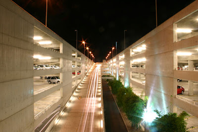
Now I'm getting close! I have some long trails of headlights, and the exposure isn't so bright that I feel like I'm going to get a headache. I increase the exposure time once more to 15 seconds, and shot a couple more frames, and this is the one I like the best:
Geeky details: ISO 100, Exp 15 sec, F-stop f/22
This is still not perfect as it's still a little bright, but I had fun and learned something, so that's what counts, right?
Sunday, February 27, 2011
Coffee Card Challenge | Hybrid
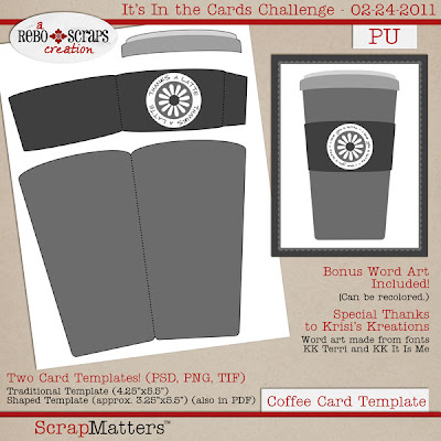
I've definitely been busy scrapping this month, and my poor blog has been neglected. I'll do some catching up soon! One thing that kept me busy was creating my first card template for a challenge over at ScrapMatters. Anyone who knows me knows that I love my coffee, so what could be better than a card shaped like a coffee cup?
Interested in giving it a try? The template download includes PSD, TIF and PNG files for two different cards - the shaped card like the one in my photo, and one that has a coffee cup on the front of a traditional rectangle card.
Visit the ScrapMatters It's In the Cards challenge forum to get the download link!
 |
| Check out more of my projects in my Hybrid Project Gallery |
Interested in giving it a try? The template download includes PSD, TIF and PNG files for two different cards - the shaped card like the one in my photo, and one that has a coffee cup on the front of a traditional rectangle card.
Visit the ScrapMatters It's In the Cards challenge forum to get the download link!
Thursday, February 3, 2011
New Obsession
The Graphics Fairy. Fabulous free clip art, mostly vintage and all fabulous! Go check it out!
Thursday, January 13, 2011
Peacemaker Card | Hybrid
This is for the It's In the Card's challenge at ScrapMatters. Check it out to download a free template and give hybrid a try! I was inspired by the bird element in this kit, and created the word art in combination with the kit's alpha. I cut out several copies of the bird to create a 3-dimensional element on the front of the card.
 |
| For credits and more projects, please visit my Hybrid Gallery. |
Monday, January 10, 2011
Sea Babies Shower Invitation
Oh, sad, neglected blog! I have LOTS of catching up to do! But for now... posting current instead of what's already past!
I designed this baby shower invitation for my sister-in-law who is co-hosting this shower for her sister, expecting a boy! The request was for something to match her chosen nursery theme, Sea Babies, as seen here:
Congratulations, Sarah! I can't wait to meet baby Joey!
I designed this baby shower invitation for my sister-in-law who is co-hosting this shower for her sister, expecting a boy! The request was for something to match her chosen nursery theme, Sea Babies, as seen here:
And here's the invitation I created:
Subscribe to:
Posts (Atom)


